


RU
NU ANSR - международный консалтинг по построению клиентоцентричности и клиентского опыта. Сектор рынка: B2B. Желаемые клиенты: Сбер, Газпром, Альфа-банк, Яндекс, ВК, Ozon, Самокат, Додо Пицца и т. д. Крупные компании и бизнесы премиум-сегмента. ЦА: владельцы, топ-менеджеры и middle-менеджеры компаний.
Задачи дизайна
- Формирование имиджа надежного партнера по бизнесу и друга, с которым можно строить долгосрочные успешные отношения
- Сохранить черно-белую палитру
- Показать, что компания создает положительные впечатления для своих клиентов и их клиентов
- Отразить в дизайне то, что компания дает своим клиентам актуальные решения
- Донести ценности компании: честность, структурность, качество и заботу
- Показать, что компания создает положительные впечатления для своих клиентов и их клиентов
- Отразить в дизайне то, что компания дает своим клиентам актуальные решения
- Донести ценности компании: честность, структурность, качество и заботу
EN
NU ANSR is an international consulting company for building client-centricity and customer experience. Market sector: B2B. Desired customers: Sber, Gazprom, Alfa-Bank, Yandex, VK, Ozon, , Dodo Pizza, etc. Large companies and businesses in the premium segment. Target audience: owners, top managers and middle managers of companies.
Design objectives
- Formation of the image of a reliable business partner and friend with whom you can build long-term successful relationships
- Save the black and white palette
- To show that the company creates positive impressions for its customers and their clients
- Reflect in the design that the company provides its customers with relevant solutions
- To convey the values of the company: honesty, structure, quality and care
- To show that the company creates positive impressions for its customers and their clients
- Reflect in the design that the company provides its customers with relevant solutions
- To convey the values of the company: honesty, structure, quality and care
RU
Логотип
Cмыслы заложенные через изогнутую часть буквы “А”:
Cмыслы заложенные через изогнутую часть буквы “А”:
- гибкость, креативные новые решения
- отношение к клиентам
- удовлетворенная улыбка клиентов
своих клиентов.
- NU ANSR не переделывает компанию, а добавляет нюанс в её работу, что символизирует и нюанс, добавленный в букву “А” логотипа. Также за счет этого нюанса буква “А” не замкнутая, она открытая, что отражает открытость бренда.
- удовлетворенная улыбка клиентов
своих клиентов.
- NU ANSR не переделывает компанию, а добавляет нюанс в её работу, что символизирует и нюанс, добавленный в букву “А” логотипа. Также за счет этого нюанса буква “А” не замкнутая, она открытая, что отражает открытость бренда.
EN
Logo
The meanings laid down through the curved part of the letter “A”:
- flexibility, creative new solutions
- attitude towards customers
- satisfied smile of the clients
of their clients.
- NU ANSR does not remake the company, but adds nuance to its work, which symbolizes the nuance added to the letter "A" of the logo. Also, due to this nuance, the letter “A” is not closed, it is open, which reflects the openness of the brand.


RU
Графические приемы
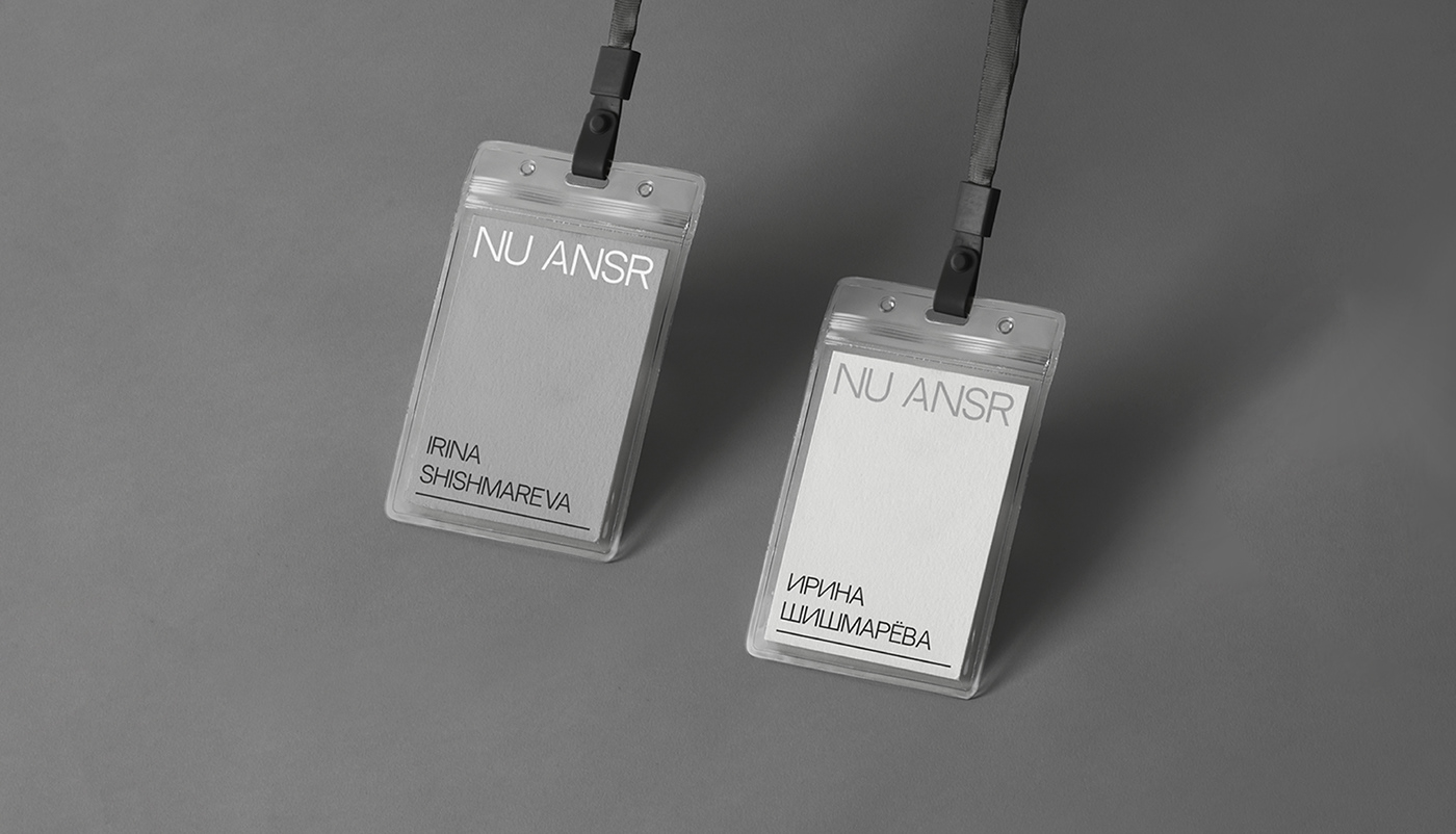
Линия внизу - метафора фундамента, крепкого фундамента клиентоцентричности и развития, который строит команда NU ANSR. Компанию можно сравнить с призрачным рыцарем, придающим процессам прозрачность оставаясь за кадром, но после их появления все изменяется. Эта метафора транслируется через использование полупрозрачных материалов таких, как калька, матовое стекло и матовый пластик.
Линия внизу - метафора фундамента, крепкого фундамента клиентоцентричности и развития, который строит команда NU ANSR. Компанию можно сравнить с призрачным рыцарем, придающим процессам прозрачность оставаясь за кадром, но после их появления все изменяется. Эта метафора транслируется через использование полупрозрачных материалов таких, как калька, матовое стекло и матовый пластик.
EN
Graphic techniques
The line below is a metaphor for the foundation, the solid foundation of customer-centricity and development that the NU ANSR team is building. The company can be compared to a ghost knight, who gives transparency to processes while remaining behind the scenes, but after their appearance everything changes. This metaphor is translated through the use of translucent materials such as tracing paper, frosted glass and frosted plastic.


RU
Благодарю за просмотр!
Дарья Солохненко - бренд-дизайнер, графический дизайнер
EN
Thank you for watching!
Daria Solokhnenko - brand designer, graphic designer


